Bad font is something most people do not have to worry about — that is, until they have to read it. While some more ornate font styles may be appealing for design or advertising, using them as your sitewide copy style would be disastrous. Imagine trying to read 1,000 words written in a varsity-athletic font.
Poor font choice isn’t just tacky, though. It can contribute to higher churn rate on your website, with visitors bouncing off without bothering to read your content. Perhaps more importantly, it can also be a barrier on your website that excludes people with disabilities, such as low vision and dyslexia. Not only is font style important to consider, but so is your website’s code. If designed inappropriately, your website could prevent users from resizing text and formatting it to their preference.
Web accessibility laws, such as section 508 of the Rehabilitation Act and the Americans with Disabilities Act (ADA), do not prescribe which specific font families to use. However, font and text formatting are fundamentally important for a website due to several factors, including:
- Professionalism
- Usability
- Accessibility
Why Proper Font Use Is Important
Accessible typography is rooted in your website being easy for everyone to use. It can be tempting to use elaborate styles or unconventional formatting to make a website stand out. Just remember, simplicity goes a long way when it comes to making sure your website is efficient and has the biggest impact.
Usability
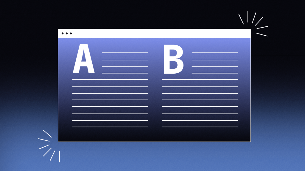
Universal usability should be the goal of your website. Choosing one standard font and formatting for your website’s style guide will ensure no one gets confused when navigating your website, and your visitors will be able to complete form fields or follow call-to-action prompts.
Make sure your writing stays succinct and clear, avoiding jargon and technical language when possible. The more your font and writing is usable, the better your overall user experience will be.
Professionalism
Font inconsistency and complexity are tacky. Using too many typefaces in site layout and promotional material diminishes your marketing authority. A strange font can also leave a user with a poor impression of your business. Opt for professional and standard text to present your organization as one people can trust, employ, and do business with.
Accessibility
Web accessibility standards require sites to be perceivable no matter someone’s ability. ADA-compliant fonts enable all people with low visual acuity or dyslexia to recognize individual letters based on their characteristics while simultaneously not interfering with non-text information and interface elements.
Examples Of Font Use To Avoid
Providing specific inaccessible fonts is likely not beneficial, as there are vastly more non-compliant typefaces than there are accessible ones. It is much more helpful to explain what makes a font type inaccessible so we can recognize them and avoid using them.
Inaccessible Fonts
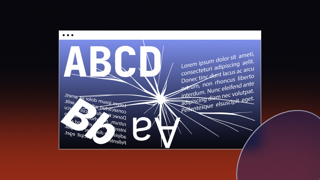
Fonts that position lettering too close, such as skinny and narrow font types, can create challenges in distinguishing between characters and should be avoided. Script-styled fonts which use decorative ticks should also be avoided as letters flow together and across one another, creating the potential for an individual with a visual or cognitive disability to become confused while attempting to read the text. Script fonts often have an italicized style built into them and can be difficult to distinguish due to their slanting orientation.
Exotic fonts, such as outlined-only characters and ones that distort letters from their typical structure, can also be troublesome to read for everyone. Using unique fonts for long, flowing text blocks will fatigue readers and likely lead to higher churn rates on your website.
Accessible Formatting
Formatting is important, too. Fonts styled below the standard 12-point font setting are not advised, as they can cause letters to lose distinction. Left-aligned justification with indents or spaces after paragraphs is vital for readability, especially in long-form content.
Bold, underline, and italic fonts should also be used for their standard purposes. Bold and italic faces should be used sparingly for emphasis, and underlines should be reserved for hyperlinks. And be careful not to confuse <strong> with <b> tags. They may seem the same, but <strong> is an indication of how something should be understood and could be read in a lower tone by screen readers emphasizing importance.
The Most Accessible Fonts
When considering an accessible font, text size, style, capitalization, and spacing all impact how easy it is for someone to distinguish. Font and style impacts:
- Perceivability
- Tracking
- Reading
Accessibility guidelines recommend using the easiest fonts to read, which are typically the most recognizable and standard.
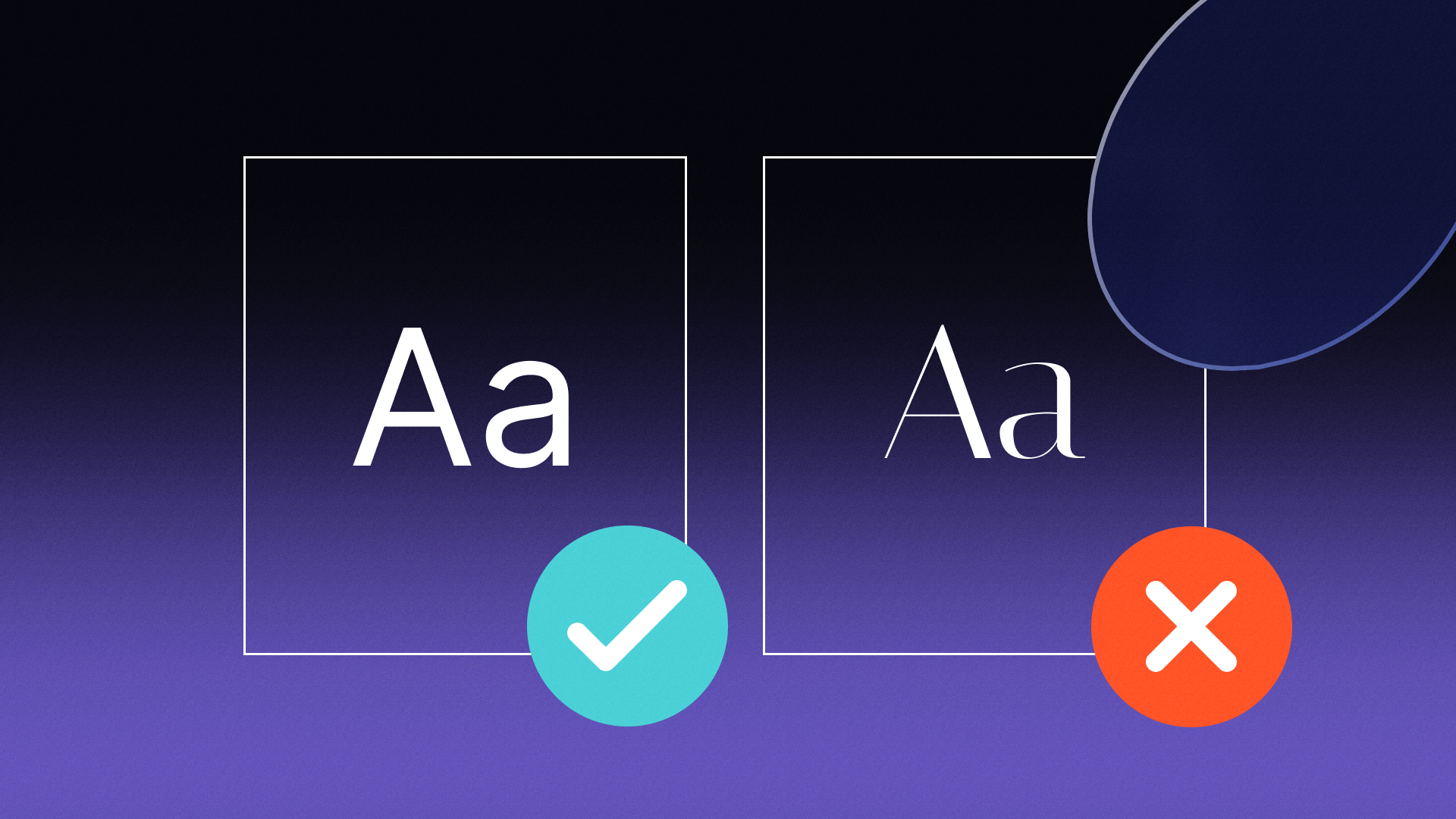
The most common and recommended fonts in the body text are Helvetica, Arial, Verdana, Times New Roman, Tahoma, and Calibri. Because of their familiarity, the easiest fonts to read are also dyslexia-friendly fonts which allow people to easily define each character, maintain easy tracking without disorientation and allow for a smooth reading experience. Any font that emphasizes style over legibility can be a distraction.
Sans serif fonts (essentially any font that doesn’t use ticks or “serifs” at the end of each letter) are preferred for digital viewing, while serif fonts (ones that include serifs) are better for print media.
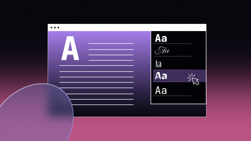
Users should be able to change the typeface of all text, including types of sans-serif and serif fonts. Some accessibility solutions are even offering dyslexia-friendly font alternatives for website visitors. These settings should offer text previews so the user can be able to see examples of the text before making a selection.
What Else to Keep in Mind
Website developers should be aware that various fonts and text formatting have different impacts on usability. This includes ensuring individuals can see each letter, being able to read sentences effectively, and for extended periods.
Each of the above elements can have an impact on the other. For example, if a text block is too small, an individual may be able to read and recognize a few words at a glance but reading for a prolonged amount of time may cause eyestrain and fatigue.
Size Does Matter
Set body font between 12 points and 14 points within a body paragraph. A large font, such as an H1 tag, should have at least 18 points.
While being mindful of accessible size is beneficial, it is not everything. Instead of points, WCAG recommends using em units to define font size so it can be altered and changed proportionally by users. Some guides suggest not setting a base font size at all for your site and allowing users’ browser settings to take priority when displaying.
Contrast
Normal text holds a 4.5:1 color contrast ratio with a website background. Headers should have at least a 3:1 ratio. Remember, a font that is sized larger has better contrast than the same font half the size.
Dynamic Elements
Again, selecting the best font for the visually impaired is an important aspect of accessible design. However, designing a website that can adapt to changes to custom text preferences is becoming much more important with the emergence of new user standards. This includes using accessibility overlay widgets, browser extensions, and native and downloadable software.
Websites should be dynamic for a user to increase text size, resize elements on the page, change the font face, increase the line spacing, kerning, justification, margins, capitalization, and toggle font style (italics, underline, bold) in text blocks. More and more websites — even the White House — are adding accessibility overlay interfaces to their websites to bring user-facing customizations to those who need them.