Remember the dress debate that hit Twitter a few years back? Was the dress blue and black or white and gold? That debate was an extreme example that highlighted how different people could perceive different colors based on contextual contrast, even though they’re looking at the same image. It’s also a prime example of how some visual contrasts on websites can create different, and possibly inaccessible experiences for some sighted users.
Flashy websites and complex design schemes can be appealing to the modern web publisher, but while something may offer an aesthetical appearance, done incorrectly, it can make your website hard, if not impossible, for many people to read.
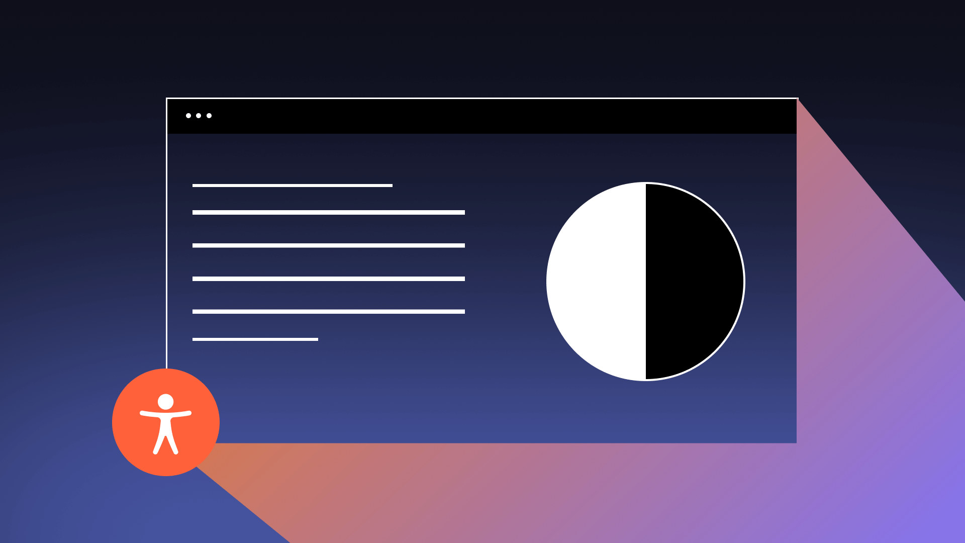
As part of one of the core principles of the web accessibility content guidelines (WCAG) 2.0, websites don’t just need to be navigatable for people who are blind and rely on screen readers, but web content must reach a threshold of distinguishability to ensure sighted readers and those with varying degrees of low vision can easily access your website.
For the run-of-the-mill web author, building a site with design specifications compliant with the WCAG color contrast guidelines, or more accurately “luminance contrast,” seems like a daunting and overwhelming task. However, it doesn’t take long to understand the basic principles involved in this web accessibility requirement. Leveraging these principles will improve the overall user experience of your website, limit strain experienced by sighted guests, and empower you to maintain compliance with WCAG standards.
Who Benefits?
As is common with accessibility standards, the more a site meets guidelines and success criteria for web accessibility, the more all users benefit.
People with disabilities who will commonly stand to benefit directly through meeting WCAG contrast success include those with:
- Color insensitive vision or “colorblindness”
- Contrast sensitivity and low acuity
- Cognitive disabilities
- Risks of seizures or physical reactions
Improper contrast can make viewing web content difficult for all sighted users, but the problems escalate for those with vision loss due to age, disease, or defect. Temporary or situationally limited individuals also benefit, such as someone who doesn’t have immediate access to their glasses or someone who is attempting to navigate a webpage while their screen is clouded with glare.
What is Luminance Contrast
The luminance contrast of text, or previously understood as “Contrast (Minimum)” and “Contrast (Enhanced)” in the WCAG 2.0 contrast and WCAG 2.1 contrast standards, is vital for sighted users. WCAG contrast ratios are a measure of the relative luminance of two elements.
Contrasts come in as a vital issue for:
- Text perceivablility
- Logotypes (text in a logo or brand name)
- Use of color & borders
- Non-text elements
Sites should either construct sites that meet WCAG standards outright or be designed to allow user preference settings to customize how the site is presented.
Text Perceivable
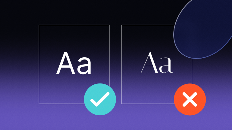
Establishing a minimum luminance contrast ratio between text and its background makes compliant websites more easily readable, even if a user does not see the full range of colors.
Today, many sites choose to place web copy over image and video fields. But if forefront text and background color or images do not feature the proper contrast luminance, users will struggle to distinguish either from the other.
The new WCAG 3.0 is currently in draft form, but it is expected to lay out a grading scale that factors in font size and font weight into how much contrast is appropriate. Generally speaking, as text gets smaller and/or thinner, visual contrast may need to be increased to achieve the same readability. The smaller the text, the higher the visual contrast required.
According to WCAG 2.1 guidelines, for sites to receive a AA level grade (the level of accessibility commonly adopted by government bodies), they must ensure that all text-to-background contrast ratios and that of adjacent colors are 4.5:1 for normal text and 3:1 for large text. When striving for AAA status, these requirements are stricter, with normal text being required to be at 7:1 contrast and large texts to be 4.5:1.
For reference, white text on a white background has a ratio of 1:1, while traditional black text on a white background carries a 21:1 contrast. The success criteria aim to benefit those with 20/40 vision, which is commonly reported as the typical visual acuity of adults around age 80. The AAA success criteria extends even farther to accommodate those with 20/80 vision. People with worse vision than this typically access web material with assistive technologies.
Contrasts in Logos
While proper visual contrasts are strongly advised for company logos, text that is part of a logo or brand name is exempt from color accessibility guidelines standards in the WCAG. However, graphic design teams still may consider guidelines when altering logos to reflect a seasonal trend or social cause.
Incidental text and images of text that are inactive or pure decoration have no contrast requirement and are all exempt from the WCAG text contrast standards.
Use of Color
For WCAG compliance, color cannot be used as the only means of “conveying information indicating an action, prompting a response, or distinguishing a visual element.” This means that common interactive web features such as form fields and links must be distinguishable from other web elements without solely using color.
If form fields have been left blank and require attention, the respective field should not just be indicated with a red border. Instead, an accompanying warning icon or in-line message pointing to the missing information should be present.
Links and hyperlinks should be also identifiable apart from a distinguishing color, such as with the use of a border, focus field, and an underline.
Common Contrasts to Avoid
Common visual contrasts affected by insensitive vision mean that depending on the size of the text, anything lower than a 3:1 luminance ratio should not be used. This can be tempting as some of these contrasts correspond with seasonal color schemes and social awareness causes, such as red/green, purple/blue, and blue/yellow.