
Well, can you? If so, it wasn’t easy. Just to be sure we’re all on the same page, it says, “Can you read this content easily? Are you trying hard enough?”
The text size, orientation, block caps, font, color contrast, character kerning, line spacing, underlining, and italic style made this opening sentence extremely difficult to read for anyone. The point of using it here is to demonstrate how formatting elements can impact how users perceive web content on your website.
It is also an attempt to provide some kind of paradigm for the challenges people with a cognitive disability, such as dyslexia, may experience when attempting to read or use a website that uses certain styles and designs.
Believe it or not, adhering to simple design and formatting guidelines will lower the barriers to usability for people with cognitive limitations. This blog will discuss some of the keys to universal design, which help us include our fellow humans with dyslexia.
The Need for Dyslexia Accessibility
According to the National Institutes of Health (NIH), dyslexia is a brain-based type of learning disability that can be caused by genetic inheritance, brain injury, or occur in the context of dementia. Dyslexia specifically impairs a person’s ability to read regardless of their intelligence level, and common characteristics include trouble manipulating sounds, spelling, and visual-verbal responses.
Dyslexia affects millions of people in the United States, with a staggering 5% to 15% of Americans — or as many as 50 million citizens — are believed to have the condition. According to the Society For Neuroscience, this likely makes it one of the most common cognitive disabilities in the world.
Dyslexia Website Accessibility
Those with dyslexia face greater challenges with memory, automizing skills, information processing, literacy, and communication.
Publishing digital content that is not structured, formatted, styled, spaced, and presented according to universal access design standards, such as the Web Content Accessibility Guidelines (WCAG), can make websites challenging to comprehend and non inclusive for those with dyslexia.
Website developers should consider three rules when accommodating people with dyslexia.
This includes:
- Friendly text;
- Accessible formats; and
- Website design.
Friendly Text For Dyslexia
Being creative with content can set your website apart from competitors and make impressions on your site visitors. However, if creativity ever leads to making site navigation or user interactions more complicated than they need to be, you are not only making your site harder to use, but you could be also creating barriers of use for people with dyslexia.
Simple Language & Assistance
Those with dyslexia have greater challenges with language and short-term memory. Your site content, page titles, and navigation tabs should avoid jargon or figurative language and instead use concise and literal text that is easy to understand. If acronyms are being cited or technical terminology is being used, it’s best to provide options to view definitions on screen.
Paragraphs should be left-aligned and have a line spacing of 1.5 points. Bullet points and summary lists are helpful to package information into clear and concise bites.
Best Font for Dyslexia
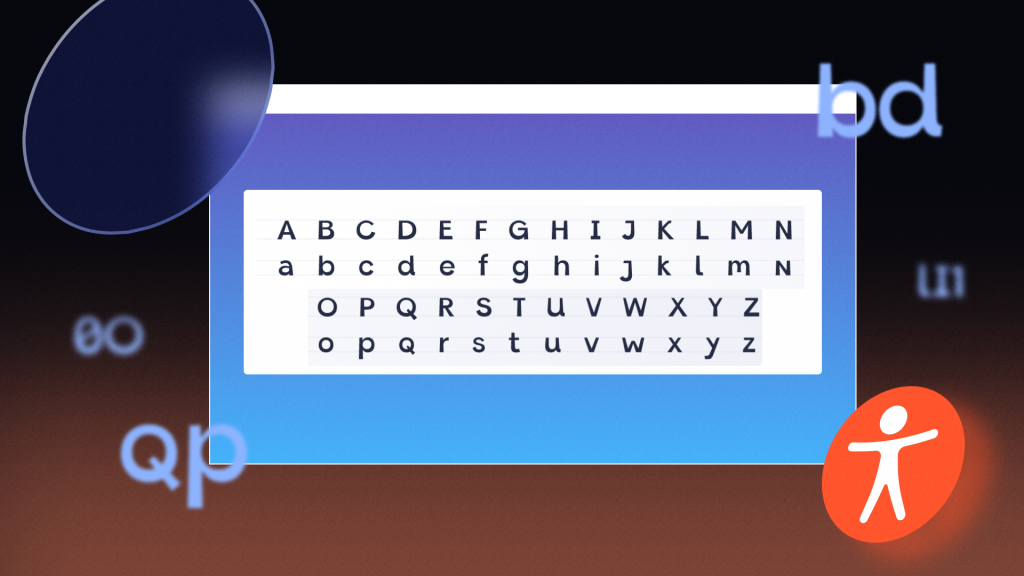
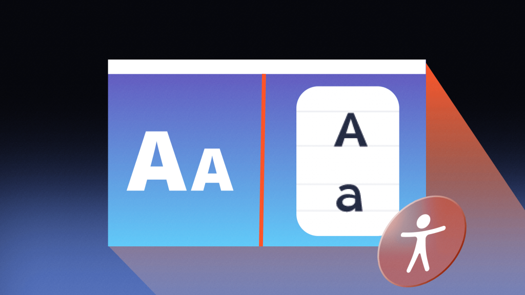
Where fonts cannot be user-customized (such as in video or interactive fields), Sans Serif fonts are generally accepted as ideal for accessibility and should be between 12 and 14-point. “BLOCK CAPITALS” should be avoided in headings, and underlines and italics used sparingly as they merge characters.
Dyslexia-friendly color contrast should meet WCAG standards, which require normal text to hold a 4.5:1 color contrast ratio. Large text and headers should have at least a 3:1 ratio.
Accessible Formats for Dyslexia
According to the World Wide Web Consortium (W3C), people may use a screen reader for dyslexia in order to help them hear content as they read along and highlight words to maintain focus. This means text needs to be optimized to work for text-reading software.
The most considerable improvements that can be made for screen readers are done so by adding a listening segment to your editorial process. One audible play-through of your content with a screen reader will give you a good idea of what doesn’t make sense or where a dictation tool may hit a snag.
This includes using formatting tools, such as heading and subheading titles, using symbols sparingly (asterisks, pounds signs, etc.), hyphenating compound words, and using tel: and ARIA labels for phone numbers.
Website Design For Dyslexia
Consistent page structure is critical for website usability. It’s also a pillar of meaningful accessibility for people with dyslexia.
While content will naturally be dynamic from page to page throughout a website, layout structure and page templates should remain relatively consistent.
For example, a website may contain a navigation header bar, a block for the main content, and a sidebar for supplementary information.
Content and structure within the middle content blocks will be different depending on the page and style of material. However, wayfinding tools and navigation in the header and footer should remain consistent throughout the website.
Other WCAG-recommended layout standards include:
- Search bar in the top right-hand corner of a website,
- Link to the home page in the top left-hand corner,
- Link to “contact us” in the top navigation area,
- Link to the site map in the footer area; and
- Submit buttons at the bottom of forms.
Themes
Page design and themes should be consistent throughout the website. Font sizes and fonts should be website-wide. Icons, such as submit buttons, should have the same design and location wherever used.
Streamlined Usability
Your website should be compatible with auto-fill functions, which enable site users to quickly fill out form fields with a simple keystroke without having to remember exotic information, such as complex passwords or detailed personal information.
Using icons and processes that are familiar and natural can accommodate the needs of people with cognitive disabilities. For example, hyperlinks should be kept to their typical presentation of being blue and underlined, and purple when the link has been clicked.
Making Sites Compatible With Assistive Tech
Websites should allow the use of browser extensions or overlay widgets that enable users to customize their experience according to their preferences. A user with dyslexia may find it helpful to change the font, font size, and text and line spacing to avoid confusion and maintain focus. A website should be designed in a way that expanding or personalizing text font does not conflict with other site regions or image or video content.
Dyslexia-Friendly Websites
Following these three universal design rules for dyslexia accessibility — friendly text, accessible formats, and website design — will optimize your digital content for people with dyslexia by making content simple, easy to understand, adaptive, and usable with assistive technology.